The previous logo was really always a placeholder which I whipped together using the site's colour scheme. Over the weeks I've had this blog going I have been toying with different ideas, just for fun.
Minimal Memphis
What I landed on is pretty minimalist and became the obvious option to me after all the time I spent looking at typography for the site. I really like the Abril Fatface font that I use for titles combined with the thick fulvous underline. That's how I ended up with this wider variant of the logo to begin with:
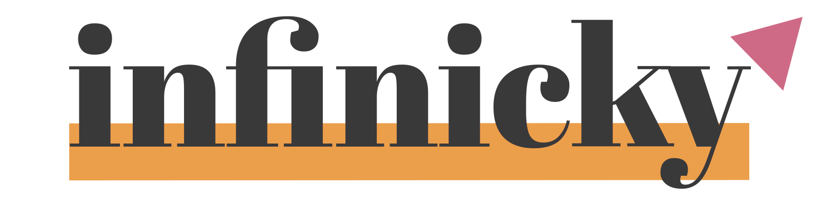
I felt it needed something extra so I experimented with additional geometry until I found the blush coloured triangle. This appealed to me at a visceral level, so I didn't question it and here we are.
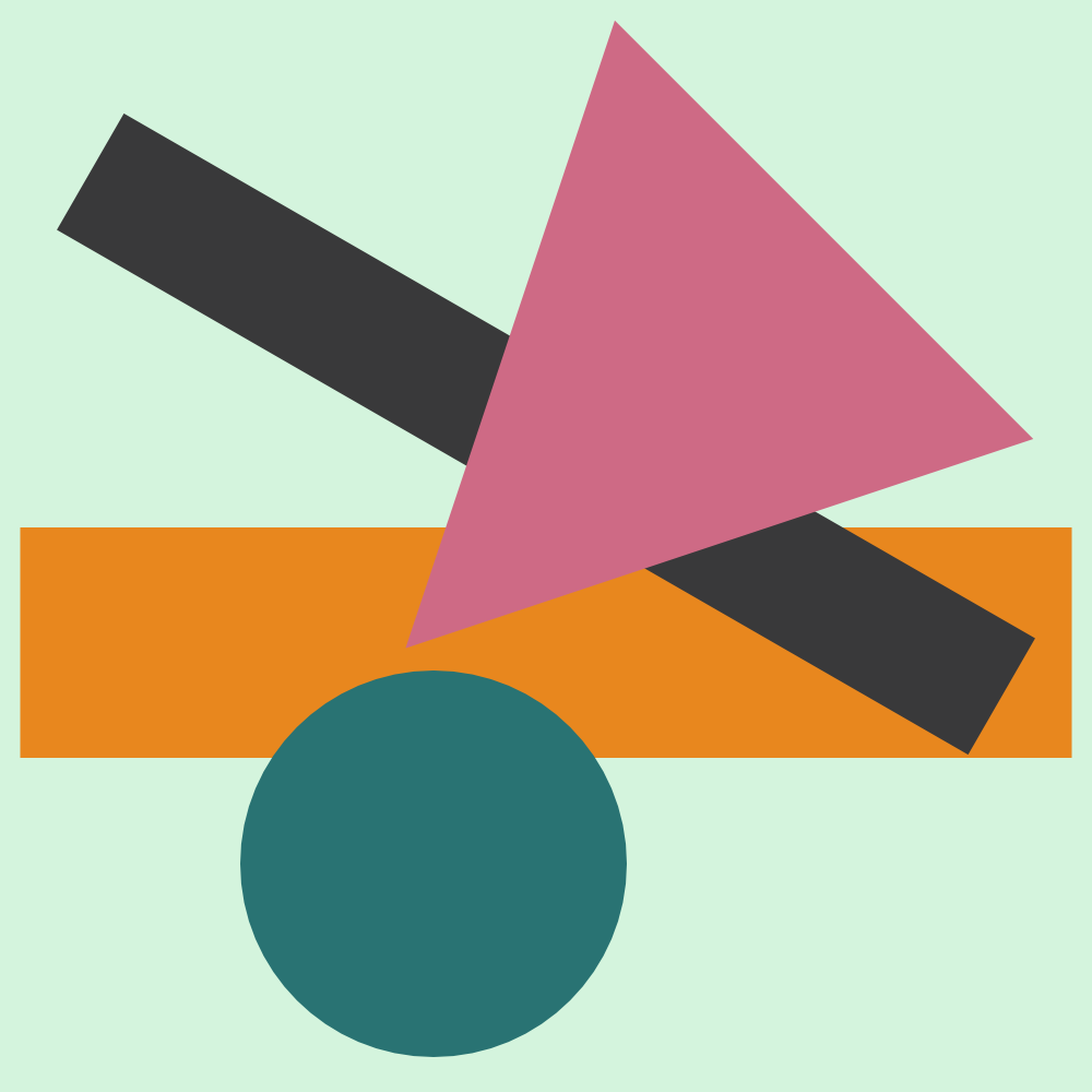
I also needed to make a square icon to replace the old favicon. So I took the same elements, replicated the site's background gradient, and foisted away the 'infinicky' in favour of a lower-case 'i'. In the same font, of course.

I am not convinced with how it looks as a favicon. It's not a discernible shape when reduced in size that much. So I made another variation which I think looks better as a favicon:
I have been watching a lot of Curb Your Enthusiasm lately, and it's only after creating these that I noticed some similarity with the Seinfeld logo:
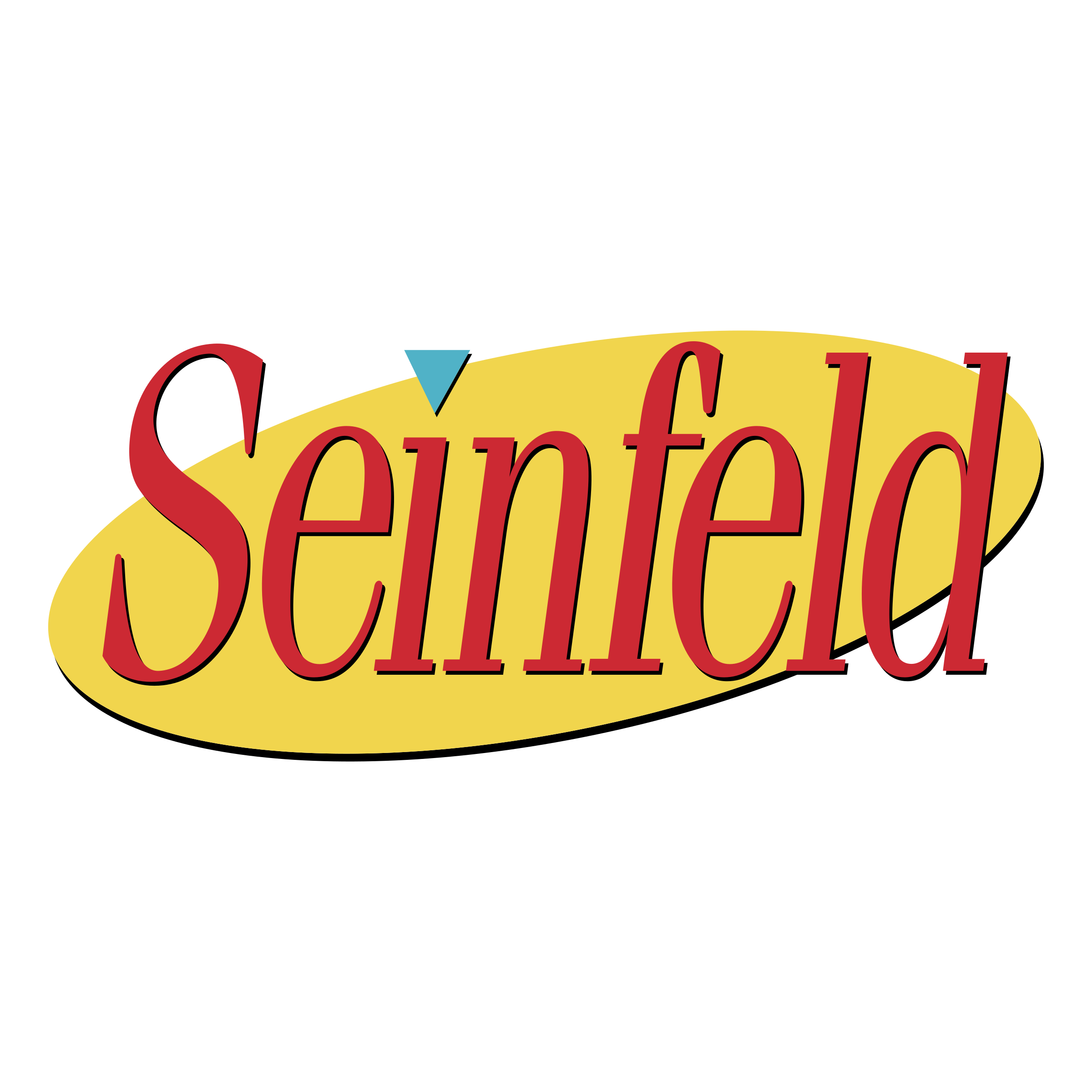
It must have crept into my work subliminally.